

Creativity
Innovation
Data Driven

Logo
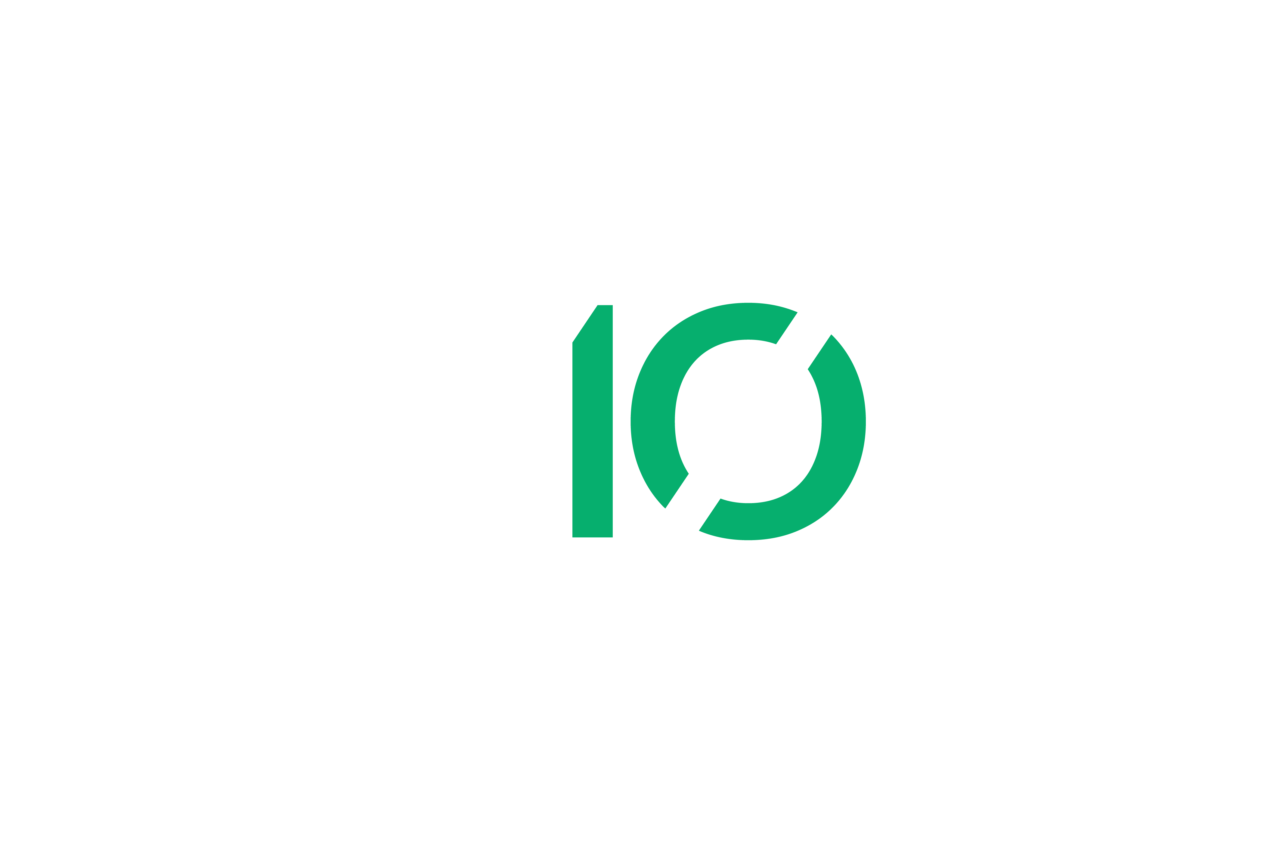
The Axiom logo is one of our most important core brand identity elements. Consistent placement, sizing, clearspace and color usage, our logo remains recognisable on any surface it's presented on.
When placing the logo, it's important that it's given enough space from the margins and other elements on the surface it's presented on. The clearspace principle derives from the size of our initial.
Our logo is designed to work at all sizes. The minimum logo size is set to a height of 30px, ensuring proper legibility. There is no set maximum size. If you go big, always remember to follow the rules of clearspace.


The Axiom logo should be used with Axiom green, black and white whenever possible. When a black or white background is not availabe a one color black or white version of the logo is acceptable to use.
Use a one color black or white when a black or white background is not available
Our logo is designed to work at all sizes. The minimum logo size is set to a height of 30px, ensuring proper legibility. There is no set maximum size. If you go big, always remember to follow the rules of clearspace.
When placing the bolt icon, it's important that it's given enough space from the margins and other elements on the surface it's presented on. The clearspace measurment derives from 1/4 the height of size of the bolt being used.
the Create innovate seal represents our core values coming together to form a foundation for our vision. The seal can be used as an alternate mark to help support the primary logo.


Our logo should always be treated with love and appear consistent throughout all surfaces. It should not be reimagined, tampered with, or modified in any way. Below are some examples of what not to do.


to the logo

")


Our primary colors are Axiom green, black and white. Simple and clean, with a clear accent color to stand out on any surface where we need immediate attention.

- HEX#06af6e
- RGB6, 175, 110
- CMYK86, 0, 78, 0
- PMS7480

- HEX#000000
- RGB0, 0, 0
- CMYK60, 50, 50, 100

- HEX#FFFFFF
- RGB255, 255, 255
- CMYK0, 0, 0, 0
Straight-forward with a clear, strong and polished voice. It never takes anything away from the topics we talk about. Our typeface is called Lato a variable font family carefully crafted & designed for digital and print environments. This typeface comes in 18 styles and different weights and now extended to 3000+ glyphs per style. It’s known for its round edges and the approachable warmth it gives to the reader. It’s now one of the most popular fonts on Google font and widely used pretty much everywhere.
